Freeman, Cooper and Co.

Freeman-Cooper-and-Co-letterhead

[An exploration of William H. Freeman and the publishing firms that he founded. This is part 6 of 8 and focuses on Roger Hayward’s interactions with Freeman, Cooper & Co.]

Despite the disappointing end to his involvement with the company that he had founded, Bill Freeman worked in the publishing industry for the rest of his life. Post Freeman & Co., he stayed with his new employer, Addison-Wesley, long enough to regain a sense of confidence. With his wife Margaret, he then set about establishing his second independent press: Freeman, Cooper & Company, a name that once again incorporated the Freeman brand, but now also included Margaret’s maiden name.

Rather than limiting the scope of their new firm to a specific discipline as Freeman had done in the past, Freeman, Cooper & Co. published books on a wide range of subjects. While Bill Freeman was still primarily interested in publishing textbooks, he shied away from entering into direct competition with his previous company. As a result, his new venture published books for academic use that were not, strictly speaking, textbooks. And while science remained a key area for the publisher, other areas including psychology and philosophy also began to populate the catalog.


hayward-1960s

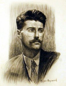
Roger Hayward, ca. 1960s

Though Freeman relished the fresh start, he still recognized the value of retaining past connections. Key among these connections was illustrator and close friend Roger Hayward, whom Freeman approached with a few project ideas in 1971. The first of these ideas was a book that he hoped Hayward would write on “the simpler and fundamental geometry of nature,” intended for use by both introductory and advanced students. He also proposed that Hayward illustrate a different book on crystallography for chemists, and a third book focusing on the chemical elements.

Hayward expressed interest in these projects, as long as Freeman could pay him royalties. Freeman agreed, but warned that the royalties might be small because the audience for each project was likely to be rather specialized. For Hayward, this was a risk worth taking, given that his royalty income from other projects was robust enough to absorb a potentially low payout from these new ventures. Having arrived at this understanding, Freeman’s only additional request of Hayward was that he not complete illustrations for any rival publishers. This was also an easy request to fulfill as Freeman, Cooper & Co. were engaged in direct competition with only a few other firms.

Their agreement in place, Hayward set to work on new illustrations and an early draft for his geometry of nature book, contacting Freeman regularly to keep him apprised of his progress. By this point in his career, Freeman no longer held his authors to strict deadlines, so long as they did a good job of staying in touch. In their exchange of letters, Freeman provided gentle guidance to Hayward as he developed his text. When Hayward broached the idea of including anecdotes from his personal life in the book, Freeman expressed reluctance. And while he ended up telling Hayward to proceed, he advised caution: too much autobiography could harm an author’s academic authority, he felt, though the right amount of personal narrative could work to forge a deeper connection with students.


cooper-structure

Drawing of a Cooper Structure as published by Ruth Walker in October 1973.

Once Freeman had piqued Hayward’s interest with these smaller projects, he unveiled the idea that he was most excited about, an organic chemistry manuscript by Ruth Walker, a chemist at Hunter College. Hayward enthusiastically agreed to provide illustrations for the text, but soon became enmeshed in a familiar set of struggles: when Walker raised concerns about Hayward’s initial drafts, the illustrator refused to make changes.

Most of Walker’s concerns were over small or superficial details in the illustrations, but a particularly contentious debate ultimately led to a significant advancement. As part of his portfolio for the Walker project, Hayward had created a paper model of a tetrahedron that was designed for students to tear out and construct into own molecule. While on board with the idea, Walker claimed that the instructions that Hayward had written were inaccurate and that the overall design was ineffective.

Unable to resolve the debate themselves, Walker and Hayward brought the matter to Freeman. The publisher was intrigued by Hayward’s unique design, but agreed with Walker that it would be difficult for students to follow the instructions that Hayward had provided. As a means of clarification, Freeman suggested a minor modification – the addition of dotted lines to indicate the direction in which students should bend the model. He also promised Hayward that he would collect more authoritative opinions from accomplished chemists and reconvene with him before the publication of the text.

Several of the chemists that Freeman contacted agreed that Hayward’s model was unique and had potential as a teaching tool. When Freeman relayed this feedback to Hayward, the illustrator immediately took steps to patent his design. Freeman assured him that the copyright protecting the material in the book would be sufficient for this purpose as well.


Hayward's-letter

Once it was established that Hayward and, to some extent, Freeman had created something new, Freeman’s associates in the scientific world went about naming the structure. They eventually settled on the Cooper Structure, an obvious source of frustration for Roger Hayward. Peeved, he crafted a short memo to Freeman that was written in the large, bold typeface that he had adopted as a result of worsening eyesight. “For goodness’ sakes,” it read, “What’s wrong with the Hayward Structure?”

Freeman replied that the Hayward Structure was actually the first name that had been proposed, but that the group of scientists couldn’t arrive at a consensus. Some other names they tried included the Freeman Structure, a hopper crystal, a starved tetrahedron (because of the model’s concave sides), an inverted dodecahedron, an instellated polyhedron, a Texas Tetrahedron, and a Cooper Crystal. The Cooper Structure was the name that everyone ultimately agreed upon. Hayward belatedly suggested the HFC Form – for Hayward, Freeman, Cooper – but his suggestion was largely ignored.

Changing tactics, Hayward once again began investigating a patent, arguing that  copyright protections simply prevented anyone from publishing the design. Freeman remained sympathetic to Hayward’s feelings, but firm in his resolution that a patent was not necessary. As time moved forward, Hayward sensed that he was losing the fight and that the process had moved beyond him. In fact, because Freeman’s modification is what made the model effective, Ruth Walker gave him credit for the discovery. In a Journal of Chemical Education article, she wrote

A unique model for illustrating the tetrahedral geometry of sp3 bonding is obtained when the pattern in the figure is cut out and assembled…the resulting structure is a tetrahedron with four recessed faces and a central hole, and has been named the Cooper Structure. Each face is recessed in such a way as to produce a model that clearly shows the relative position of four bands extending from the center of a tetrahedron, one towards each apex. This model was designed by William H. Freeman for inclusion in ‘Organic Chemistry: How to Solve It (I. Molecular Geometry)’ by Ruth A. Walker, after Mr. Freeman observed models made by Roger Hayward, the illustrator of the organic workbook published by Freeman, Cooper and Co. in 1972.

Hayward was somewhat placated by the wording of the article, which let him claim a share of the credit for the design. He proceeded to recommence work on his geometry of nature book, but never finished it as his health problems increased in severity.


Meanwhile, Bill Freeman was also experiencing his share of setbacks. Just before the Cooper Structure conundrum arose he was hospitalized for exhaustion, which slowed production considerably and led to a period of prolonged discouragement. In a letter to Hayward, he made reference to “hurdles, disappointments, problems and shenanigans that I dare not put into print.” And for all the fuss that it caused, Ruth Walker’s book, Organic Chemistry – How to Solve It, sold only 11,000 copies.

Over the course of its history, Freeman, Cooper, and Company experienced moderate success, but never achieved the same fame as its predecessor. Many of the authors who had found their niche at W.H. Freeman & Co. remained loyal to the original company even after its namesake had moved on; indeed, with the notable exception of Roger Hayward, Bill Freeman built his new company largely from scratch. He insisted though, that modest successes did not diminish his passion for the independent press. After he passed away in 1992, Margaret took over the firm and ran it smoothly for a few additional years before letting it go to become another piece of publishing history.

Roger Hayward at Freeman & Co.

roger-1930s

Roger Hayward, ca. 1930s.

[An examination of the history of the W.H. Freeman & Co. publishing house as viewed through the lens of Linus Pauling and his colleagues. This is part 2 of 8.]

As Linus Pauling’s chemistry series at W.H. Freeman & Co. moved forward, a third member of the team proved to be of crucial importance: illustrator Roger Hayward.

As we’ve covered previously, Bill Freeman initially employed Hayward to create the illustrations for Pauling’s General Chemistry textbook and, suitably impressed, wound up commissioning him for a number of other projects. Freeman quickly saw that Hayward was an incredibly talented illustrator and the two formed a close friendship that lasted through the years.

Freeman even recruited Hayward to design his new office when the company moved from Market Street. Freeman was colorblind and admitted that he needed help when it came to outfitting a space. In the past, he had relied upon a “Vice-Presidents-in-Charge-of-Decoration” committee made up of several female colleagues, but ultimately decided that Hayward’s insights were a better fit. In particular, Freeman commissioned Hayward to create an illustration meant specifically to hang in his office. Hayward gladly obliged and, a few weeks later, presented Freeman with a large illustration of molecules that – as Freeman’s staff informed him – were a lovely shade of apricot.


gen-chem

A Hayward illustration used in the first edition of General Chemistry, 1948.

Professionally, Hayward was a fundamental asset to the company, and in more ways than one. For example, when Freeman was courting John D. Strong, then at Johns Hopkins, for a book on optics, Hayward played a crucial role in convincing Strong to sign with the San Francisco firm rather than a larger publishing house on the East Coast. Once secured, Hayward and Strong worked well together, engaging in lively discussions as they collaborated on the manuscript.

As their relationship flourished, Freeman became a strong supporter of Hayward and his work. On one noteworthy occasion in the early 1950s, a textbook published by Houghton-Mifflin came under scrutiny because it contained a number of illustrations that closely resembled those that Hayward had created for use in General Chemistry. Hayward noticed immediately and brought the matter to Freeman’s attention. In his reply, Freeman suggested that

No one can copyright an idea. One can copyright the expression of an idea. This last applies, not only to the use of words…but to illustrations as well.

Believing that Houghton-Mifflin had indeed committed a violation of this type, Freeman became aggressive. In the end, he negotiated a deal with the president of the company stipulating that Houghton-Mifflin would pay a $0.04 royalty fee to Hayward for each copy sold.


betty-roger

Betty and Roger in 1956.

Hayward’s value was such that Freeman ultimately thought it wise to offer him a contract with the company, rather than enlisting him periodically as a freelancer. While beneficial to the company, this contract also offered the promise of a steady wage and a new era of financial security for Roger and his wife Betty.

The agreement seemed simple on paper. Hayward would continue to receive royalty payments for relevant books published prior to the contract, but for future work, he would receive an annual salary of between $4,500 and $7,500, ($40,000 to $67,000 in today’s dollars) depending on how many hours he logged. And though he would be on salary, Hayward would not be asked to be physically present at the office as long as he kept track of the time that he spent working on projects for the company.

The contract specifications were satisfactory for Hayward, particularly because of the royalties language, as continuation of these payments would insure some degree of income for Betty were Roger to pass away suddenly. Indeed, perhaps the most significant benefit of the contract was the health insurance that the company offered to Hayward, who suffered from asthma. Importantly, the insurance agreement stated that Hayward and his family would receive health benefits during the run of the contract and also for two years after any event that led to his incapacitation or death. The only new requirement of Hayward was that he commit to completing illustrations for the exclusive use of Freeman & Co. and a partner publication, Scientific American magazine.


strong3

Hayward illustration used in Concepts of Classical Optics, by John D. Strong, 1958.

After a period of negotiation, Hayward agreed to terms and, in 1958, began working as a contract employee. His first task was to experiment with alternatives to color printing and texturing. While Freeman knew that color printing might help set his firm apart from its competitors, he worried that the costs were too high. With Hayward, Freeman tinkered with screen tone and half-tone techniques, but neither proved especially successful.

Other professional complications emerged not long after. A year into his contract, Hayward began to feel that he was being treated more as a draftsman than an artist, and was too often compelled to engage in what he described as “uncongenial work.” Freeman was sympathetic to Hayward’s lament, but only to a point:

The boys around here certainly have tried to see that each of us doesn’t have to misuse his talents or have a disproportionate amount of the uncongenial. How in the world could we keep this spirit if we had an exception, one sharing in the perquisites but able to rule (by himself) that he would not do some share of the work because he decided it was uncongenial?

But drudgery wasn’t Hayward’s only concern. Increasingly he felt that authors were overly critical of his illustrations and unwilling to give him the respect that he deserved. As Hayward grew more and more unhappy, Freeman found himself spending a great deal of time mediating. This wasn’t necessarily out of character; he often referred to himself as “Old Man Freeman,” a persona of wisdom and benevolence that he felt he needed to embody as director of the company.

In Hayward’s case however, this persona began to wear thin. Circumstances reached a boiling point when George Pimentel, who published The Hydrogen Bond with Freeman in 1960suggested corrections to drawings that Hayward had provided. Upon learning of these suggestions, the illustrator took immediate offense and refused to complete the project. Freeman intervened to remind Hayward that authors greatly respected his skill as an artist but that his job as a company employee was to take direction from the authors or, at the very least, to negotiate with them. In response, Hayward wrote

I see nothing in that [contract] which commits me to the philosophy that the author or any other person is always right. I certainly would never sign a contract which would require me to satisfy any person or persons who are not a party to that instrument.

Growing impatient, Freeman’s reply was terse

We and our authors are the sole judges of what goes into a book and you legally must abide by that principle or you do not fulfill your part of the bargain with this company.

Suitably chastened, Hayward apologized to both Freeman and Pimentel and resumed illustrating.

With enough of these conflicts however, Freeman saw that a contract was no longer benefiting the authors, the company, or Hayward. Eventually he offered to terminate the agreement and allow Hayward to revert back to freelance status, receiving additional payments on a royalty basis. Hayward accepted and his relationship with the company, as well as his friendship with Freeman, quickly returned to a mutually respectful and co-productive state.

The Architecture of Molecules

arch-mol

[Part 2 of 2]

By the end of the 1950s, Roger Hayward had retired from his professional work as an architect at the same time that his career as an illustrator was reaching its peak. And with this came a new measure of security: having worked chiefly as a freelancer in the past, Hayward signed a contract in the early 1960s that helped to solidify his position as a technical artist.

The contract that Hayward signed was with W.H. Freeman & Company, a San Francisco-based publishing house that rose out of relative obscurity primarily by publishing Linus Pauling’s hugely popular textbook, General Chemistry. First released commercially in 1948 (with illustrations by Roger Hayward), General Chemistry went through two more stateside editions, the last appearing in 1970.

Such was the pedagogical import of General Chemistry that it was translated into at least eleven languages, including Gujarati, Hebrew, Swedish and Romanian. Indeed, for several years Pauling made more money off of royalties from his textbook than he did from his Caltech salary. The impact of the book was similarly lucrative for the publishing house and its success cemented a long and close connection between the Freeman firm and Pauling.

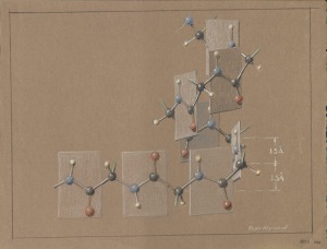
The Double Molecules of Acetic Acid. Pastel drawing by Roger Hayward.  As with all of the pastels used as illustrations with this blog post, the Acetic Acid pastel shown here was not the final version published in "The Architecture of Molecules."

The Double Molecules of Acetic Acid. Pastel drawing by Roger Hayward. As with all of the pastels used as illustrations with this blog post, the Acetic Acid pastel shown here was not the final version published in “The Architecture of Molecules.”

For many years W.H. Freeman & Co. had also collaborated with Scientific American, publishing a selection of the magazine’s articles as offprints. Roger Hayward often found himself in the middle of this collaboration as he frequently illustrated publications for both companies.

The partnership between the two organizations proved so fruitful that, in 1964, they decided to merge, the hope being that W.H. Freeman might grow into the nation’s leading publisher of scientific texts. The joining of these two companies that he knew so well was a positive turn of events for Hayward, in part because it led to the publication of what would become his most acclaimed work, The Architecture of Molecules. A beautiful and innovative book co-authored with Linus Pauling, The Architecture of Molecules ultimately sold over 15,000 copies and featured some of Hayward’s best-known scientific illustrations.


The structure of Diamond.

The Structure of Diamond.

In his papers, Hayward’s first mention of the book appears in a letter written in March 1964 to his long-time friend and colleague John Strong, then living in Baltimore, Maryland.  In it, Hayward mentions in passing

I have just signed up to illustrate a Molecular Architecture book with Linus. The Freeman & Co. are to publish and all the figures are to be in color. I expect something like 75 figures some of which I have already done.

The idea behind the new book was to use illustrations to attract audiences from all backgrounds to an informative work on structural chemistry. The volume also represented one of W.H. Freeman’s first attempts to step away from strictly academic subjects in favor of publishing a scientific work marketed to a non-academic demographic.

Though not a technical monograph, The Architecture of Molecules was scientifically exacting in its own way. The book features Hayward’s colorful pastel conceptualizations of molecules and basic chemical bonds, and presents them side-by-side with Pauling’s concise but informative explanations of what the reader is looking at. From the first, the publication was very much a joint Hayward-Pauling project and Pauling, as with his publisher, saw the book as a tool to broaden the public’s understanding of chemistry in “an atomic age.”

The Ferrocene Molecule.

The Ferrocene Molecule.

It stood to reason then that work on the book was divided, with each author showing off some of their best qualities in their respective contributions. Hayward, of course, made it his duty to illustrate molecules with the utmost geometric and proportional accuracy. Likewise, Pauling provided pithy descriptions of the molecules and bonds being depicted, and did so in the inimitable style that characterized so much of his writing.  Witness, for example, Pauling’s discussion of Left-Handed and Right-Handed Molecules of Alanine:

There are two kinds of alanine molecules, which differ in the arrangement of the four groups around the central carbon atom. These molecules are mirror images of one another. The molecules of one kind are called D-alanine (D for Latin dextro, right), and those of the other kind L-alanine (L for Latin laevo, left). Only L-alanine occurs in living organisms as part of the structure of protein molecules.

Other amino acids, with the exception of glycine, also may exist both as D molecules and as L molecules, and in every case it is the L molecule that is involved in the protein molecules of living organisms. Some of the D-amino acids cannot serve as nutrients, and may be harmful to life.

In Through the Looking Glass Alice said, ‘Perhaps looking-glass milk isn’t good to drink.’ When this book was written, in 1871, nobody knew that protein molecules are built of the left-handed amino acids; but Alice was justified in raising the question. The answer is that looking-glass milk is not good to drink.


Folding the Polypeptide Chain.

Folding the Polypeptide Chain.

“My major asset in my work,” Hayward once wrote,” is an interest in and skill in three-dimensional thinking. This is coupled with a great interest in how things are put together both as an arrangement in space and in the physical sense.” In this sense, The Architecture of Molecules nicely summarizes Hayward’s true passions.

And in Pauling, Hayward was teamed with a more than capable second set of eyes. Most notably, Pauling’s familiarity with the time period’s cutting edge research enabled him to make suggestions for updates to some of the illustrations that Hayward already had in hand. His urgings also resulted in the inclusion of crystal structures as a more significant part of the book than was originally envisioned.

At various points throughout its 120 pages, The Architecture of Molecules also stresses the importance of understanding how the basic principles of chemistry are part of every-day life. Structures like the heme molecule and the alpha helix are therefore presented as exciting examples of newly discovered molecular structures that play a central role in the lives of all beings.


The Tetragonal Boron Crystal.

The Tetragonal Boron Crystal.

After hitting the market late in 1964, The Architecture of Molecules received generally positive reviews, though some critics took pains to point out that the book represented “Pauling’s view of the universe at the molecular level.” At the time, knowledge of the structure of atoms and molecules remained mostly based in theory – microscopes of the era still could not see on the molecular level and x-ray diffraction remained a technique that required years of practice to master – and Pauling’s ideas on chemical bonds, while hugely influential, were not universally accepted.

The increased use of x-ray diffraction within the discipline, however, further pressed the need for a compilation of illustrated molecules to be used as a tool for teaching chemistry. Pauling was also a firm believer that students would learn better if they understood the physical characteristics of chemical compounds. Based as they were in the latest findings, the illustrations featured in Pauling and Hayward’s book represented a contemporary vision of molecular structure.

The Architecture of Molecules clearly fit a niche and it sold relatively well – over 12,000 copies purchased in the U.S. and another 3,500 overseas.  Part of the book’s foreign gross came by way of two translations; a Japanese version appeared in 1967 and a German edition was released two years later.

Today The Architecture of Molecules certainly stands as Roger Hayward’s highest profile publication, and arguably his most important. Hayward was a huge talent, remarkable in his ability to combine a desire for scientific development with a strong artistic aesthetic. Never formally trained as a scientist, Hayward’s work as an illustrator and as a colleague of some of the top researchers of his time earned for him a permanent place in the history of science communication and education.

Illustrating Science

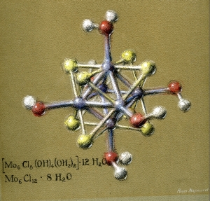
Pastel drawing of the molecular structure of molybdenumdichloride. By Roger Hayward, 1964.

Pastel drawing of the molecular structure of molybdenumdichloride. By Roger Hayward, 1964.

[Ed Note: Of the thirteen books that Linus Pauling authored or edited, The Architecture of Molecules stands out as being very different. A slender volume of just over 100 pages, the 1964 publication consists almost entirely of beautiful and intricate pastel representations of molecular structures drawn by Roger Hayward and contextualized with short scientific descriptions authored by Pauling.  This is post 1 of 2 exploring the back story behind this unique book as well as its publication.]

It is not unusual to find pictures of Linus Pauling surrounded by three-dimensional molecular models or with drawings of molecules and their bonds covering his work space. Pauling believed that understanding the physical properties of molecules was crucial to understanding their chemical interactions. This guiding principle made Pauling an influential figure in his use of models and illustrations to explain the properties of substances.

Pauling’s 1947 textbook, General Chemistry, became a best-seller in part because because it presented novel new methods for teaching chemistry at the undergraduate level. The book incorporated quantum physics, atomic theory and real-world examples in explaining basic chemical principles, and a key feature of the text was that it used illustrations like nobody else had done before. Prior to the publication of General Chemistry, the properties of atoms and molecular bonding were described and taught in such a way that students were required to think abstractly about chemical reactions without a full understanding of the physical interactions that caused these reactions. General Chemistry changed all that.

From his high school years through his post-graduate studies, Pauling had experienced numerous approaches to teaching chemistry. Pauling, of course, had been asked to teach introductory chemistry while himself an undergraduate at Oregon Agricultural College, and it was during a similar stint teaching freshman as a graduate student at Caltech that Pauling began to devise a plan for his revolutionary textbook. He was certain that in this new project, illustrations and diagrams would serve an essential role in engaging students and helping them to understand the fundamentals of chemistry.

Luckily for Pauling, members of the Caltech faculty had already developed a close connection with an unusually skilled Pasadena artist, inventor and architect – Roger Hayward. His keen ability to illustrate scientific concepts in an accurate and accessible way made him the perfect choice to create the visuals for Pauling’s textbook.


Illustration by Roger Hayward of a high-vacuum apparatus as published in Procedures in Experimental Physics, 1938.

Illustration by Roger Hayward of a high-vacuum apparatus as published in Procedures in Experimental Physics, 1938.

A trained architect, Roger Hayward’s career path was unique, to say the least. A recent transplant from the East Coast when the Depression hit, Hayward was forced to expand his occupational enterprises well beyond architecture, as sour economic times dried up the building design market for several years running. While this was surely a difficult transition for Hayward, the period did grant him the opportunity to cultivate his creativity and his talents in many other fields of interest.

As he endeavored to make ends meet, Hayward’s artistic inclinations led him to explore broad new avenues, from painting to puppeteering. For a time, he even satisfied his interests in scientific experimentation by performing research in the field of optics and ballistics at the Mt. Wilson Observatory, studies which ultimately resulted in his attaining seven patents for optical devices and procedures. Indeed, Hayward had already made a place for himself in the sciences by the time that Pauling approached him with the offer to illustrate General Chemistry. Aside from his optics work, Hayward had already illustrated a number of scientific publications, including a textbook, Procedures in Experimental Physics.

The principal author of Procedures in Experimental Physics was Hayward’s close friend John D. Strong, a professor of physics and astronomy at Caltech. Strong felt comfortable collaborating with Hayward because he was very familiar with his friend’s interests in science and art, and he appreciated his strong aptitude in both disciplines. Procedures in Experimental Physics was a success, and both Strong and Hayward received good reviews for their work.

Buoyed by this strong critical reception, Hayward’s continuing interest and understanding of architecture, art and science positioned him well within the community of scientific illustrators. As with others, Hayward was adept at creating an aesthetically appealing yet technically precise illustration. But the trait that really set him apart was the pleasure that he took in researching the science behind his assignments. In many respects, Hayward was as much a scientist as he was an artist.


Roger Hayward, ca. 1960s.

Roger Hayward, ca. 1960s.

Published in 1938, Procedures in Experimental Physics marked the beginning of a new and prosperous chapter of Hayward’s unique career. During this period, scientific illustration would be the main focus of his energies, with architecture and the fine arts slipping well into the background. As his reputation grew, he found regular work with Scientific American, a popular science magazine, and was commonly sought out by professors at Caltech. It was during this time as well that Pauling became acquainted with Hayward. Not surprisingly, when Pauling needed to find an illustrator for his first college text book, his thoughts immediately turned to Hayward.

Working with Pauling, however, was not the same as working with John Strong. Strong had such a high appreciation for Hayward’s work as both a scientist and an artist that he split royalties on basis of space coverage. This meant that Strong assigned as much monetary value to Hayward’s illustrations as he did to his other co-authors’ written work. Strong’s perspective, however, was rather unique and when Pauling first asked Hayward to illustrate General Chemistry, he did not expect the illustrations to cost as much as Hayward billed.

Most scientists, including Pauling, believed that the training, research and experimentation from which a text results have more merit than do illustrations. Though he placed a premium on visual depictions, in Pauling’s mind it seemed fair to assign more value to the text than to the illustration. Pauling’s publisher, William Freeman of W.H. Freeman & Co., agreed with Pauling and referred to Hayward as “a bit of a prima donna” because he believed that Hayward overestimated the value of his work. In his correspondence with Pauling, Freeman also revealed that Hayward had regularly come into conflict with his firm over compensation issues. The company, however, continued to contract with Hayward simply because his illustrations were unsurpassed.

After settling their differences, Pauling and Hayward began to bond over their similar interests. By then, John Strong had taken a position in Baltimore at Johns Hopkins University. His closest science-minded friend now on the other side of the country, Hayward increasingly came to use his connection with Pauling to further discussions on scientific advances.

Hayward’s background as an artist and architect also enabled his exploration of three-dimensional molecular models, a pursuit of special affinity for Pauling, and once again, the two began discussing each other’s ideas. Pauling suggested that Hayward use models to convey recent findings in structural chemistry, especially regarding crystal structure. Gradually, through many conversations, Pauling too came to recognize Hayward as a scientist, rather than merely a skilled artist.

A Major New Resource on Roger Hayward

The polymath Roger Hayward, a favorite of ours over the years, at last has a major web exhibit devoted to him that is worthy of his talents. At forty-three chapters long and containing some 432 images, Roger Hayward: Renaissance Man is now the authoritative resource on Hayward’s remarkable life.

For those unfamiliar with the Hayward story, here is some text from the official press release announcing the public launch of this exhibit.

Born in New England just before the turn of the century, Hayward attended the Masschusetts Institute of Technology, where he graduated with honors in architecture. Despite having built a reputation in the Boston area as a talented fine artist as well, Hayward and his wife moved to southern California in the late 1920s, lured by the offer of a position as Chief Designer at the Los Angeles-based Cram & Ferguson architecture firm.

With the stock market collapse of 1929 and the onset of the Great Depression, Hayward was forced to expand his skillset in order to make ends meet. His solutions to this dillema were an indication of the remarkable creativity that defined his professional life. For one, he crafted puppets and performed puppet shows in his home for a fee. He also built three looms for his wife Betty, whose resulting textiles were sold at local markets. Indeed, Hayward’s ingenuity resulted in numerous patent applications over the course of his life for products ranging from fountain pens to nut crackers to baby bassinets.

Over time, Hayward’s relationship with many scientists at the California Institute of Technology served to bolster his interest in the sciences. Hayward also worked on behalf of the United States government during World War II and became an expert on the subject of optics. He is now believed to have been a key contributor to the development of the Schmidt-Cassegrain telescope.

Following the war, Hayward built a reputation as a scientific illustrator of great import, providing visuals for Scientific American‘s “Amateur Scientist” column for nearly twenty-five years and collaborating with Linus Pauling on numerous publications including 1964’s The Architecture of Molecules, for which Hayward served as co-author.

The Roger Hayward Papers, upon which the exhibit is built, arrived in Oregon in circuitous fashion.  Our first contact with the collection came in 2004 during which time our staff was conducting copyright research for the website It’s in the Blood! A Documentary History of Linus Pauling, Hemoglobin and Sickle Cell Anemia, which incorporated Hayward’s pastel drawings of both normal hemoglobin and sickled blood cells – drawings which reside in the Ava Helen and Linus Pauling Papers.

(Among the highlights of the new Hayward exhibit are two galleries of his famous pastel drawings of molecules, most of which had never before been made available to the public.)

At the time, the collection resided with members of the Hayward family living in eastern Canada.  Impressed by the work that our department had done with the Pauling Papers and interested in adding to OSU’s corpus of materials related to Pauling, the family agreed, in 2009, to transfer the Hayward Papers more than 3,000 miles to our facility for final arrangement, description, preservation and access.

Page 1 of Hayward’s biographical scrapbook.

What arrived was a treasure trove of letters, drawings, photographs and notes of all kinds, including ideas for new inventions and materials developed for the Allied war effort.  Most extraordinary though was the Biographical Scrapbook that Roger meticulously kept over the course of his life.  Chock full of revealing newspaper clippings, photographs and even original art works, the seventy-four page scrapbook is a prized possession among our collections and served as the source material for much of what is presented on the Hayward exhibit.

Hayward and Caspar Gruenfeld building a moon model, ca. 1934.

Hayward and Caspar Gruenfeld building a moon model, ca. 1934.

As it turns out, the Hayward family’s decision to donate Roger’s papers to Oregon State University was an inspired one, as the resource is among our more heavily used manuscript collections.  In there three years here, Hayward’s drawings have been used in both commercial and educational contexts, and researchers have traveled from as far away as Buffalo, New York and Berlin, Germany to use the collection.  Currently, work is on-going concerning Hayward’s moon models and his puppet theater production of “The Sorcerer’s Apprentice.”

The entire experience has been immensely gratifying for us and we are pleased now to present a web exhibit that might spur further inquiry into the life of an extraordinary personality, a true Renaissance Man.

Dr. Ina Heumann, Resident Scholar

Ina Heumann

Dr. Ina Heumann, a historian of science affiliated with the Max Planck Institute for the History of Science in Berlin, is the most recent individual to complete a term as Resident Scholar in the Oregon State University Libraries Special Collections.  Heumann spent two months in Corvallis studying the Roger Hayward Papers and the Ava Helen and Linus Pauling Papers as part of her on-going investigation into the connection between art and science with a specific focus on illustrated scientific texts.

From her study of the relationships built by Roger Hayward over his more than three decades as a scientific illustrator, Heumann found that significant tensions regularly arose between scientist and artist.  Without doubt, prominent among these tensions was the issue of money.  One striking example involved Hayward’s provision of a large bulk of illustrations to the publishing house W. H. Freeman & Co. for use in the first two editions of Pauling’s profoundly successful text General Chemistry.  While Pauling’s General Chemistry royalties in 1949 alone amounted to $5,000, Hayward received roughly $120.  Indeed, questions over just compensation for the value added by illustrations in scientific texts would dot Hayward’s long association with the Freeman company. And while both sides usually found room for compromise in their periodic bargaining sessions, the discussions were often acrimonious.

Of equal or even greater importance were issues of hierarchy and respect.  As many, including Heumann, have pointed out, Hayward was no ordinary illustrator.  For one, he thoroughly researched the science behind the instruments and processes that we was depicting; in that sense he “knew what he was drawing” on levels far beneath the surface.  At the same time, it was of vital importance to Hayward that his drawings be understandable and comfortable to the reader.  As he wrote

I try to put in enough familiar details so the reader will recognize them and feel on familiar ground.  Therefore I am careful to show more detail of glassware, for instance, than he really needs.

Despite the level of thought and attention that Hayward poured into his work, Heumann uncovered numerous instances in which Hayward was made to understand his place in the pecking order.  As most bluntly discussed by William H. Freeman in an important letter sent to Pauling in January 1953, Hayward was viewed as

a bit of a primadonna.  He has to be handled just so.  He thinks of himself as a professional person – which he is – who wants to be treated as such, rather than as a skilled craftsman.  Like all artists (and he is one of those, basically), he is a bit of a problem and [in] this case a bit of a genius.

Heumann argues that Hayward should more accurately be thought of as a “border crosser.”  In her Resident Scholar talk, she fleshed out this idea:

Hayward was architect, artist, craftsman, illustrator and inventor, not to mention his interest and competence in chemistry, optics, physics or mathematics.  However: The only formal degree he had was in architecture and technical engineering.  He was a self-made man, someone who loved to ‘get the books and dig the knowledge out’ by himself, as he once put it….Thus Hayward’s talent to serve as intermediate figure rooted at the same time on his deficiency: he was always in-between, being neither a scientist nor a mere illustrator, neither an educated expert nor just an average layman….Consequently, he was both needed and at the same time neglected.

It was this status as “border crosser” that lay at the heart of many of the creative and professional constrictions with which Hayward and his peers struggled throughout much of the twentieth century.

Hayward enjoyed a far more harmonious relationship with Scientific American magazine, whose “Amateur Scientist” column he illustrated for some twenty-four years.  Described by publisher Dennis Flanagan as “a marriage made in heaven,” Hayward’s partnership with the magazine proved fruitful for all parties involved.  The column, in particular, provided Hayward with an opportunity to stretch his intellectual wings given that he was, in essence, an amateur scientist himself.  And so it is that the illustrator regularly, in Heumann’s words,

contributed countless ideas and suggestions for improvements of the devices he had illustrated.  The letters were often literally published in the column, citing Hayward as an experienced expert of amateur science.  He illustrated and commented on questions like ‘How to measure the Metabolism of Animals,’ ‘Cloud Chambers and Detecting Nuclear Events,’ or how to construct inexpensive x-ray machines.

At their zenith, the “Amateur Scientist” columns were excellent examples of “scriptovisual documents” – documents that “can be read and looked at simultaneously.”  So too was the 1954 journal publication “The Structure of Protein Molecules,” authored by Linus Pauling, Robert Corey and Roger Hayward, and containing nine columns of text and nearly eighteen columns of drawings.

It is these sorts of scriptovisual documents, Heumann argues, that most directly prove the worth of the work done by individuals like Hayward.  For centuries drawings have enabled scientists to develop their own ideas in private and have likewise become essential to communicating complex information to a broader audience.  It was and remains morally and intellectually correct for scientific illustrators to place a premium on their work.  On the same token, the study of scientific illustration remains a tantalizing prospect for further historical examination.  As Heumann writes, “It becomes very obvious in the papers of Roger Hayward: behind the images is a story as worthy to be told as behind the texts.”

The OSU Libraries Special Collections Resident Scholar Program is supported by the Peter and Judith Freeman Fund. Past recipients have included Dr. Burtron Davis of the University of Kentucky’s Center for Applied Energy Research, Toshihiro Higuchi of Georgetown University, Dr. Mina Carson, professor of history at Oregon State University, Jane Nisselson, a documentary filmmaker based in New York City and Julia Bursten, Ph.D. candidate at the University of Pittsburgh.

“There is no substitute for doing things with your own hands.”

Self-portrait by Roger Hayward, ca. 1930s.

Self-portrait by Roger Hayward, ca. 1930s.

In the archival world, scrapbooks are typically regarded to be “high-value” items, deserving of close descriptive and preservation attentions.  As we work our way through the arrangement and description of the Roger Hayward Papers, we are reminded again as to why scrapbooks are held in such high regard.

Though the Hayward Papers consist primarily of correspondence and sketch books, the collection’s lone biographical scrapbook is especially noteworthy for its inclusion of dozens of photographs, newspaper clippings and original art works that are not otherwise replicated elsewhere in the collection.    Flipping through the pages, one is reminded that Hayward was much more than an illustrator noteworthy for having provided technical drawings for scientists the likes of Linus Pauling.


Portrait of Betty Hayward, Roger's wife of fifty-seven years.

Portrait of Betty Hayward, Roger's wife of fifty-seven years.

Weaving looms designed and built by Roger in the mid-1930s for Betty's use.  During the Depression, Betty's Navajo-inspired textiles helped contribute to the household income.

Weaving looms designed and built by Roger in the mid-1930s for Betty's use. During the Depression, Betty's Navajo-inspired textiles helped contribute to the household income.

Roger, Betty and Roger's brother Julian also constructed puppets and staged puppet shows at their house and at the Caltech Atheneum - another source of income during hard times.

Roger, Betty and Roger's brother Julian also constructed puppets and staged puppet shows at their house and at the Caltech Atheneum - another source of income during hard times.

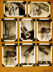
Throughout his life, Roger maintained a keen interest in optics and would eventually hold four patents related to telescope design.  This is likely the first telescope that he built.

Throughout his life, Roger maintained a keen interest in optics and would eventually hold four patents related to telescope design. This is likely the first telescope that he built.


Hayward to Sara Ross, Sept. 16, 1967, p. 1.

Hayward to Sara Ross, Sept. 16, 1967, p. 1.

Hayward to Sara Ross, Sept. 16, 1967, p. 2.

Hayward to Sara Ross, Sept. 16, 1967, p. 2.

This two-page letter, written by Hayward in 1967 to a woman requesting career advice for her son, an aspiring artist, is a tidy example of Roger’s multiplicity of skills, including his facility with words.  His career advice, and perhaps his philosophy of life, is neatly encapsulated near the end of the document.

If there were available a course in ‘How to Learn’ it might be a good preparation for science illustrating.  A next best subject might be the History of Science.  I found ‘A History of Technology,’ edited by Singer Holmyard, Hall & Williams (Oxford, 1957) of some interest, at least through the first two volumes, but sense that the editors haven’t soiled their fingers by actually doing the things they write about.  There is no substitute for doing things with your own hands.

To learn more about Roger Hayward, see our blog series devoted to his life and work.

Blivets from Roger Hayward

The oft-reproduced fig. 6 from "Blivets - Research and Development," 1968.

The oft-reproduced fig. 6 from "Blivets - Research and Development," 1968.

Roger was always interested in the meaning and interpretation of art, vision, and especially color. As his vision started to fail, he resigned from professional work and started to tinker. One interest was the development of drawings and articles for the Worm Runners Digest, for which Roger authored many publications. The first and perhaps best-known is 1968’s “Blivets-Research and Development” (vol X, no 2) in which he constructs a number of pleasing but impossible diagrams. (Fig. 6 of this issue has been reproduced in a number of other publications. )

-from Roger Hayward (1899-1979): The Western Years, Part 2

Another example of Hayward's popular Blivets series.

Another example of Hayward's popular Blivets series, as published in Worm Runners Digest.


A note on Hayward’s moon model

Readers with an interest in Hayward’s incredible body of work are encouraged to read Kevin Kidney’s terrific blog post on the creation and eventual star turn of Hayward’s 50:1-scale moon model, (referenced here under “Pasadena Life”) commissioned in 1934 by the Griffith Observatory in Los Angeles and eventually enlisted for use by the Disney company.  The exactness of the moon model and the Escher-esque whimsy of the Blivets above are a true testament to the envious diversity of skills with which Hayward was blessed.

Roger working on the Griffith model of the moon. (Los Angeles Public Library photograph, Security National Bank Collection).

Roger working on the Griffith model of the moon. (Los Angeles Public Library photograph, Security National Bank Collection).

Thingums from Roger Hayward: A Few Sketches

We are very pleased to announce that the Roger Hayward Papers are now part of the OSU Libraries Special Collections.  To commemorate the occasion, here are three sketches from Hayward’s notebooks.

Gothic sketches commissioned by Cram and Ferguson, 1926.

Gothic sketches commissioned by Cram and Ferguson, 1926.

In 1925, Hayward moved to Cram and Ferguson, a well-known Boston architectural firm specializing in gothic design. Cram and Ferguson were working on the New York cathedral, St. John the Divine, and Roger did a number of architectural designs and renderings of the north face.  He also did similar artistic renderings for the two World War I military cemeteries in France at Aisne-Marne and Oise-Marne for which Cram had commissions. Ralph Cram sent Roger and his wife Betty to Europe in 1926 to examine and sketch many classical buildings and to see “real Gothic structure”. During the trip, Roger filled sketchbooks with his carefully-rendered drawings and color studies.  This “inspection trip” would be valuable in developing ideas for many of the later California architectural projects. Although his trip was confined to Italy, France and England, one of the sketch books opens with a watercolor drawing of the Hagia Sophia in “Constantinople.”

-extracted from Roger Hayward (1899-1979): Architect, Artist, Illustrator, Inventor, Scientist

Commercial Radio Ads, undated.

Roger worked “for the fun of it”. He was a curious individual and was satisfied when he discovered or exhibited something new. In this regard he was a true dilettante, but a brilliant one.

-extracted from Roger Hayward and Linus Pauling

Much more on Roger Hayward is available here.

A Thingum from Roger Hayward

Pastel drawing of a compound of Molybdenum Dichloride. Drawing by Roger Hayward, 1964.

Pastel drawing of a compound of Molybdenum Dichloride. Drawing by Roger Hayward, 1964.

Mother was an artist’s daughter. I was expected to draw just as I was expected to eat or talk or anything else, and I wasn’t praised for the results.

I decided on architecture because I hoped that it would provide a balanced diet of aesthetics and mechanico-science. The diet is short on science, and so my hobbies in later years have tended towards science.

During this period (‘38-‘39) I had R.M. Langer of Cal Tech tutor me in modern atomic theory. I gave him a painting for his effort.

– Roger Hayward, letter to “Doc” C.L. Stong, editor of Scientific American and Amateur Scientist.  December 22, 1950.

Roger Hayward, who illustrated many of Linus Pauling’s publications and enjoyed a fruitful collaboration with many Caltech scientists, liked to refer to “thingums” in various discussions.  The Oregon State University Libraries Special Collections is the future home of the Roger Hayward Papers. In celebration of this event, over the coming months we will be posting a variety of short “thingums” in an effort to bring forth the unique talents of this man who excelled as an artist, architect, engineer and scientist.

Much more on Roger Hayward is available here.